Infographic / Edu Visual - Manus GPT Image 2.0 Comparison Slide

A Japanese corporate infographic slide comparing AI slide-generation methods and tools, ideal for social posts or presentation decks.

提示词

3,199 字符打开 Astorie 创作台 ↗
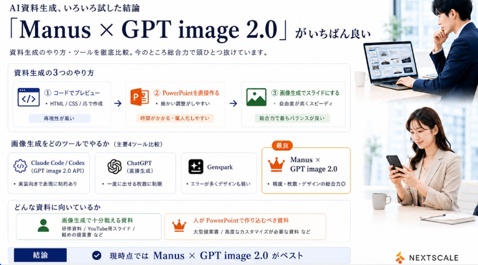
Goal: Create a polished Japanese business infographic slide comparing AI presentation-material generation methods and tools, with a corporate white, navy, orange, and green palette. The main message is that Manus × GPT image 2.0 is currently the best overall option.

Canvas: Wide 16:9 landscape slide, clean white background, thin light-gray card borders, deep navy typography, subtle blue-gray shadows. Leave a right-side vertical photo strip occupying about 24% of the canvas.

Header: At top left, small Japanese lead-in text using {argument name="small header text" default="AI資料生成、いろいろ試した結論"}. Below it, a very large elegant serif headline using {argument name="main headline text" default="「Manus × GPT image 2.0」がいちばん良い"}. Under the headline, add a smaller subtitle using {argument name="subtitle text" default="資料生成のやり方・ツールを徹底比較。今のところ総合力で頭ひとつ抜けています。"}.

Right photo area: Add exactly 2 realistic business lifestyle photos stacked vertically with soft bright office lighting. Top photo: a Japanese businessman in a navy suit working at a laptop showing slide thumbnails, seated near a window, face softly blurred. Bottom photo: a Japanese businesswoman in a beige blazer looking at a smartphone at a desk, face softly blurred. Keep the photos cropped cleanly with white margins, matching the slide’s corporate look.

Section 1 layout: Create a large rounded rectangle card titled "資料生成の3つのやり方". Inside it place exactly 3 horizontal method cards connected by two right-pointing arrows. Method 1: blue code icon, label "① コードでプレビュー", small text "HTML / CSS / JSで作成", bottom pill "再現性が高い". Method 2: orange PowerPoint icon, label "② PowerPointを直接作る", small text "細かい調整がしやすい", bottom pill "時間がかかる・属人化しやすい". Method 3: green image icon, label "③ 画像生成でスライドにする", small text "自由度が高くスピーディ", bottom pill "総合力で最もバランスが良い".

Section 2 layout: Below, add a title "画像生成をどのツールでやるか(主要4ツール比較)" and exactly 4 equal comparison cards in a row. Card 1: Claude Code / Codex, gear/code icon, sublabel "(GPT image 2.0 API)", bullet "実装向きで表現に制約あり". Card 2: ChatGPT, OpenAI knot icon, sublabel "(直接生成)", bullet "一度に出せる枚数に制限". Card 3: Genspark, sparkle icon, bullet "エラーが多くデザインも弱い". Card 4: highlighted best card with orange border and crown icon, small orange badge "最良", title using {argument name="best tool name" default="Manus × GPT image 2.0"}, bullet "精度・枚数・デザインの総合力◎".

Section 3 layout: Add a rounded box titled "どんな資料に向いているか" with exactly 2 side-by-side suitability cards. Left card with green person icon: title "画像生成で十分戦える資料", examples "研修資料 / YouTube用スライド / 軽めの提案書 など". Right card with orange crown icon: title "人がPowerPointで作り込むべき資料", examples "大型提案書 / 高度なカスタマイズが必要な資料 など".

Bottom conclusion bar: Full-width light-blue conclusion strip with a navy label box reading "結論", a circular check icon, and large conclusion text using {argument name="conclusion text" default="現時点では Manus × GPT image 2.0 がベスト"}.

Branding: Bottom right place a small orange abstract mark and the word "NEXTSCALE" in dark gray. Keep all text crisp and aligned, use Japanese business-slide typography, avoid clutter, and do not add any extra cards beyond the counted 3 method cards, 4 tool cards, 2 suitability cards, and 2 photos.
来自原帖查看来源 ↗

更多灵感

Product Marketing - Classic Cafe Date Outfit Prompt

Product Marketing - Classic Cafe Date Outfit Prompt

のぞむ*AIイラストGPT Image 2
OUTFIT:
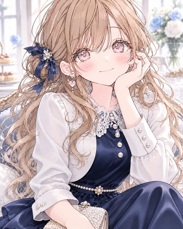
A {argument name="dress color" default="navy blue"} satin midi dress with elegant long sleeves and a delicate white lace collar, creating a refined, classic silhouette.

Accented with a thin pearl belt at the waist and layered with a small white bolero jacket for a graceful feminine touch.

Styled with black Mary Jane heels decorated with small ribbon details and a compact pearl clutch bag.

Elegant, romantic, classic café-date fashion aesthetic.
Navy blue, crisp white, black, and pearl ivory color palette.
Smooth satin, delicate lace, luminous pearls, and polished fabric textures.
Sophisticated, feminine, timeless seasonal styling.
Social Media Post - Watercolor Illustration Comparison Poster

Social Media Post - Watercolor Illustration Comparison Poster

SairahGPT Image 2
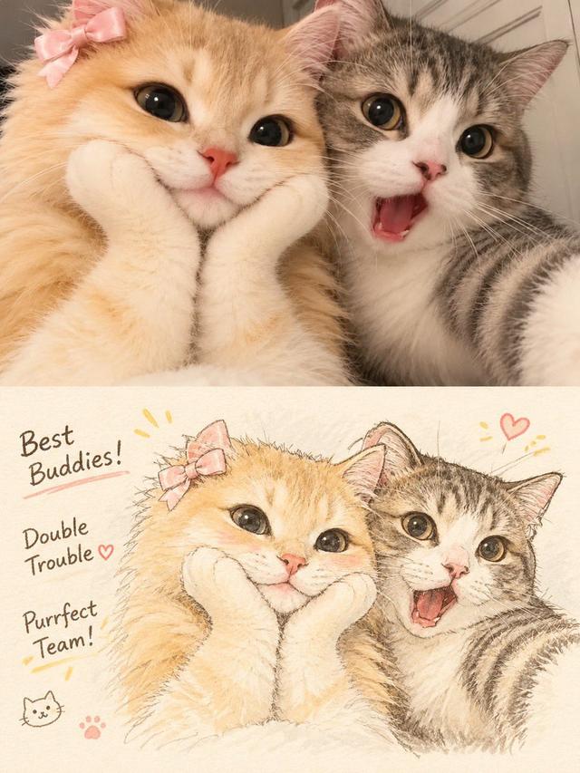
Transform the uploaded photograph into a beautiful, hand-drawn watercolor illustration comparison poster.

LAYOUT & COMPOSITION:
Create a vertical 3:4 poster divided into two equal horizontal sections.

TOP HALF — ORIGINAL PHOTO:
Display the original uploaded photograph exactly as it is. Preserve the original subject, pose, clothing, background, lighting, colors, and composition without alterations.

BOTTOM HALF — WATERCOLOR ILLUSTRATION:
Recreate the exact same photograph as a delicate, hand-painted watercolor and colored-pencil illustration. Preserve the subject's identity, facial features, hairstyle, expression, clothing, pose, proportions, and surroundings.

Use soft watercolor washes, delicate ink outlines, visible pencil strokes, subtle paper texture, warm pastel tones, gentle shading, and beautifully imperfect hand-drawn details. Give the illustration a charming Korean/Japanese lifestyle sketchbook aesthetic.

DECORATIVE DETAILS:
Add handwritten playful typography that complements the subject and scene. Include small hand-drawn doodles such as hearts, stars, arrows, crowns, underlines, or sparkles. Generate a short, creative phrase that matches the subject's personality or mood.

BACKGROUND:
Maintain the original environment but reinterpret it with loose watercolor brushstrokes, simplified scenery, and soft artistic details.

OVERALL STYLE:
Dreamy, cozy, youthful, elegant, artistic, and slightly whimsical. Use warm off-white textured watercolor paper as the illustration background.

IMPORTANT:
- Keep the original photograph completely unchanged in the top section.
- The bottom illustration must clearly depict the exact same moment.
- Do not invent additional people or objects.
- Maintain strong visual similarity to the original photograph.
- Make the typography look naturally handwritten, not digitally typeset.
- Ensure a clean 50/50 split with balanced composition.

High-quality editorial art poster, 3:4 vertical aspect ratio.
Social Media Post - Outfit of the Day Fashion Collage

Social Media Post - Outfit of the Day Fashion Collage

SairahGPT Image 2
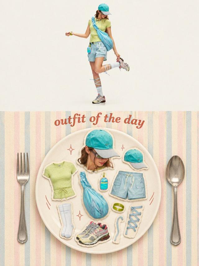
Transform the uploaded photo into a stylish OUTFIT OF THE DAY editorial fashion collage in a vertical 3:4 composition.

TOP SECTION (50%):
Create a full-body, high-end fashion editorial photograph of the person wearing the exact outfit from the reference image. Preserve their facial identity, hairstyle, clothing, colors, accessories, shoes, and natural proportions. Use a clean, warm ivory studio background, soft natural lighting, and a relaxed fashion-model pose.

BOTTOM SECTION (50%):
Create a creative flat-lay fashion moodboard arranged on a large elegant ceramic plate. Display individual outfit components as realistic paper-cutout stickers with subtle white borders and soft shadows, including:
- A cutout portrait of the person.
- Top, trousers or skirt.
- Shoes and socks.
- Hat, bag, jewelry and accessories.
- Any additional objects visible or relevant to the outfit.

Arrange everything aesthetically inside the plate, as if presenting a complete outfit recipe.

DESIGN & DETAILS:
Add elegant vintage-inspired typography reading "OUTFIT OF THE DAY" above the plate. Use a pastel striped background, oversized silver fork and spoon on either side, tiny hand-drawn sparkles and playful doodles.

VISUAL STYLE:
Premium Korean fashion magazine aesthetic, Pinterest-inspired editorial design, warm cream tones, pastel colors, realistic product photography, scrapbook collage, paper-cutout sticker effect, soft shadows, playful composition and refined vintage styling.

IMPORTANT: Automatically identify the clothing and accessories in the uploaded photo. Do not invent a different outfit or change the person's identity. Every item in the flat lay must correspond to the actual outfit or its visible accessories.

Ultra-detailed, polished graphic design, balanced composition, 3:4 vertical poster.
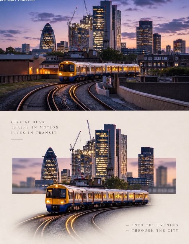
Social Media Post - Minimal Gallery Poster with Pop-Out Effect

Social Media Post - Minimal Gallery Poster with Pop-Out Effect

KGPT Image 2
Using the uploaded photo, create a 3:4 vertical poster split into top and bottom halves that touch seamlessly, with no white line, gap, or border between them.

Top: the original photo, full-bleed.

Bottom: a warm off-white textured paper background. The main subject is cut out, enlarged, and centered. Behind it, a thin horizontal rectangle shows a blurred crop of the original scene, and the subject breaks out of the frame (3D pop-out). The subject's base fades softly into the paper with natural particles, shadow, or reflection. Add small uppercase serif text in light grey with wide spacing: 3 short poetic lines at top-left and 2 lines with a "—" at bottom-right. Minimal gallery-poster style, photorealistic.
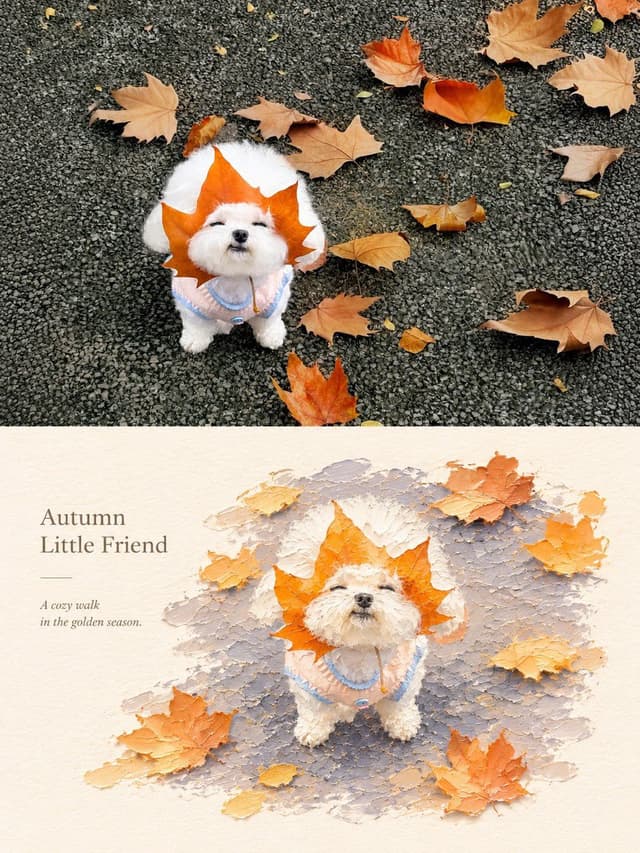
Social Media Post - Photography vs Impasto Oil Painting Poster

Social Media Post - Photography vs Impasto Oil Painting Poster

SairahGPT Image 2
Create a premium 3:4 vertical photography and impasto oil painting comparison poster using the uploaded photograph.

### LAYOUT
Divide the canvas into two perfectly equal horizontal sections (50/50):
- Top: Original photograph.
- Bottom: Artistic impasto oil painting interpretation.

Both sections must connect directly with a clean horizontal boundary, without gaps, gradients, or overlapping.

### TOP SECTION — PHOTOGRAPHY
Preserve the original subject's identity, quantity, pose, proportions, silhouette, details, composition, perspective, lighting, and natural colors. Apply only subtle premium color grading. Do not redraw, distort, duplicate, reposition, or alter the subject. No text or decorations.

### BOTTOM SECTION — ARTISTIC INTERPRETATION
Reimagine the same subject as a sculptural impasto oil painting micro-landscape. Use thick layered paint, palette-knife textures, handcrafted forms, raised edges, and expressive brushstrokes.

Keep the subject recognizable, centrally or slightly off-center, surrounded by generous warm-white negative space. Introduce a single color band inspired by the original photograph, transformed into a ground, water, pathway, or abstract landscape element.

### COLORS & TEXTURES
Extract a harmonious, limited color palette from the original photograph. Preserve the subject's natural color character while adding subtle brightness and luminosity. Use rich paint textures selectively, with refined subject details and delicate matte paper texture.

### TYPOGRAPHY
Add a short, elegant English title and one small supporting line within the lower section's negative space. Use thin, minimal typography. Generate text based on the actual subject or mood. Avoid invented dates, locations, logos, signatures, and unnecessary annotations.

### AESTHETIC
Quiet, minimal, sophisticated, and editorial. Create a collectible fine-art publication aesthetic through negative space, sculptural depth, material textures, and balanced composition.

### AVOID
Photo collages, altered subjects, unrelated scenes, illustrated photography, extra title bars, clutter, excessive decorations, incorrect text, watermarks, cartoon styles, neon colors, oversaturation, muddy tones, plastic-looking 3D, and cheap CGI.

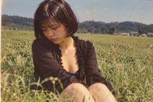
Social Media Post - Vintage Photo of Woman in Field

Social Media Post - Vintage Photo of Woman in Field

いがぐりメタボGPT Image 2
A nostalgic, vintage-style photograph of a young woman sitting in a lush green field. She has short, dark bobbed hair with bangs and is looking down with a pensive, melancholic expression. She wears a black, long-sleeved top with a deep V-neckline featuring ruffled edges. The background shows a vast expanse of tall grass or crops stretching toward distant hills under a clear sky. The image has a distinct retro aesthetic, characterized by film grain, warm color tones, scratches, and dust spots typical of old analog photography from the Showa era.

寻找下一个方向

ASTORIE CANVAS

让灵感,继续生长。

在同一个创作空间,连接提示词、参考素材和生成结果。

打开创作画布 ↗