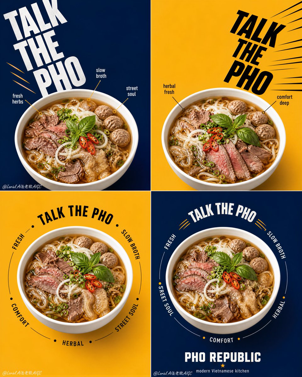
Product Marketing - Pho Republic Campaign Grid

A 2x2 grid advertising campaign prompt for a noodle brand, focusing on consistent product photography with varied typographic styles.

Prompt

5,747 charactersOpen Astorie studio ↗
Create a flagship 2x2 campaign poster series for an original Vietnamese noodle brand named "PHO REPUBLIC", merging Orbit energy with Transit restraint. Use ultra-realistic commercial food photography, not illustration, not 3D render. The final artwork must present four coordinated square posters arranged in a strict 2x2 grid, each panel built from the same structural system with disciplined variation. The pho bowl must remain the absolute visual hero in every panel. Style lock: high-end graphic food advertising, bold editorial poster layout, product-first hierarchy, clean color-block backgrounds, oversized kinetic typography, youthful premium Asian street-dining branding, Cannes-level print campaign execution. Core campaign structure: four square panels with alternating deep navy blue and warm mustard yellow backgrounds. Each panel contains one large white pho bowl shown from the exact same slightly top-down camera angle. Bowl size, bowl height, bowl perspective, rim thickness, bowl diameter, and visual weight must be perfectly consistent across all four posters. The container must sit at an equal visual scale in every panel, acting as the fixed campaign anchor. Variation is allowed only in typography rhythm, circular text paths, callout placement, and directional movement around the bowl. Transit logic: simplify every panel so the layout feels flagship and globally polished. Reduce small labels, reduce decorative callouts, shorten copy, preserve more clean negative space, and let the bowl, background block, and primary typography do most of the work. Avoid flyer-like density. Each square should feel graphic, premium, and instantly readable. Orbit logic: create a coordinated movement system across the full 2x2 set. Panel one uses a strong descending diagonal text flow, panel two uses a mirrored inward-driving diagonal, panel three uses a controlled circular orbit around the bowl, and panel four uses a tighter circular return path that visually resolves the campaign. The four panels should feel like one connected visual sequence: launch, counter, orbit, resolve. Motion must feel crisp and graphic, not noisy. Food design: create a premium beef pho hero dish with richly detailed ingredients: glowing amber broth, thin rice noodles, sliced beef, beef balls, tendon or tripe accents, basil leaves, scallions, red chili slices, onion, fresh herbs, and subtle broth sheen. Ingredient styling may shift slightly between panels, but the bowl size and bowl dominance must never change. The dish must feel abundant, fragrant, hot, and highly craveable. Panel logic: 1. Top-left panel: deep navy background, oversized stacked headline moving diagonally from upper-left toward center, bowl anchored in the lower-middle zone, a few restrained callout markers near the rim. 2. Top-right panel: mustard background, mirrored bold typography driving inward from upper-right toward center seam, bowl anchored at the same scale and height as panel one, minimal graphic accents only. 3. Bottom-left panel: mustard background, centered bowl with a clean circular text orbit around it, fewer callouts than the top row, stronger negative space. 4. Bottom-right panel: deep navy background, centered bowl matching panel three exactly in scale and placement, tighter orbit text and a compact brand footer block to conclude the campaign. Typography and branding: use original English text only, never copy any existing wording. Use a bold master phrase such as "TALK THE PHO" as the campaign anchor across the series, varied in scale and rhythm but always consistent in brand voice. Add only a few short descriptors such as "fresh", "slow broth", "street soul", "herbal", and "comfort". Include a compact brand block reading "PHO REPUBLIC" with a subtitle such as "modern Vietnamese kitchen". Typography should feel oversized, architectural, witty, and kinetic, but always secondary to the bowls. Lighting: bright controlled studio food lighting with soft frontal illumination and subtle side shaping. The broth must glow warmly, herbs must feel crisp and fresh, meat textures must remain moist and realistic, and the white ceramic bowls must look clean, glossy, and dimensional. Keep shadows soft and controlled, with no muddy contrast. Materials and realism: realistic white ceramic bowls with identical shape and scale across all four posters, hot glossy broth, tender beef textures, springy noodles, fresh basil, crisp chili slices, subtle oil shimmer, clean matte background fields, premium print-ready sharpness, and integrated graphic elements that feel designed rather than pasted. Color system: strict alternating navy blue and mustard yellow fields, with restrained accents of red, white, black, and herb green. Keep the palette disciplined, high-contrast, and premium. Food colors must remain natural and appetizing. Quality and physical rules: all four panels must feel like one unified flagship campaign. Equal bowl size across every panel is mandatory. Equal bowl camera angle, equal bowl scale, equal bowl visual weight, and equal product dominance must be preserved. Keep the campaign clean, graphic, premium, and highly legible. No clutter, no warped rims, no type collisions, no weak food detail, no dead black patches, no oversaturated broth. Negative prompt: copied branding, copied text, inconsistent bowl sizes, inconsistent bowl height, inconsistent bowl perspective, different container scale between panels, warped bowl rims, blurry food, fake broth texture, messy layout, chaotic typography, cheap flyer look, low-resolution print feel, oversaturated food colors, excessive labels, cluttered callouts, cartoon rendering, CGI look, illustration style, product losing dominance, muddy shadows, dirty background.

From sourceView source ↗

More to explore

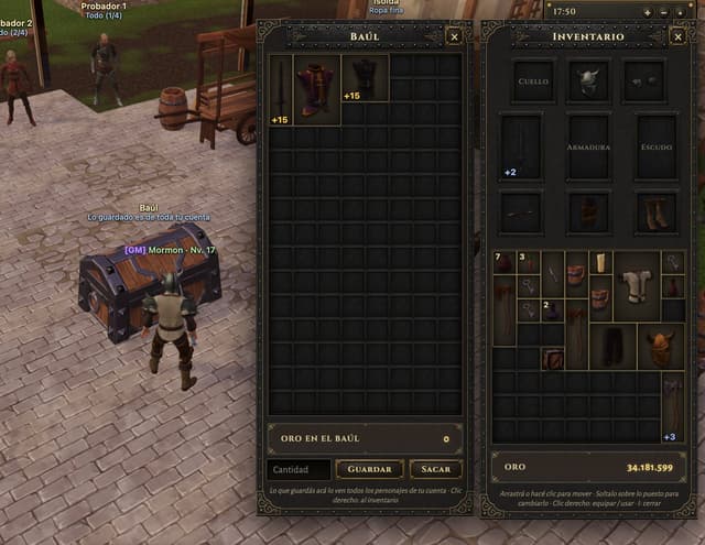
Game Asset - Medieval MMORPG Inventory UI Screenshot

Game Asset - Medieval MMORPG Inventory UI Screenshot

Mormon NegroGPT Image 2
Goal: Create a realistic screenshot of a medieval MMORPG inventory and storage interface, specifically featuring a chest (Baúl) and character equipment panel.
Canvas: Landscape orientation, high resolution, mimicking a game client window.
Layout: Split composition. The left third shows the 3D game world with a cobblestone street, a wooden cart, an NPC, and a player character standing next to a large open treasure chest. The right two-thirds are occupied by two vertical UI panels overlaying the scene.
Sections:
1. Left Panel (Storage): Header reads "BAÚL" in gold serif font on a dark metal background. Contains a grid of empty dark slots. Top row has three items: a sword (+15), a purple robe (+15), and black boots (+15). Bottom section displays "ORO EN EL BAÚL" with value 0, and buttons labeled "Cantidad", "GUARDAR", and "SACAR".
2. Right Panel (Inventory): Header reads "INVENTARIO". Top section is an equipment paper-doll layout with slots labeled "CUELLO", "ARMADURA", "ESCUDO" containing a helmet, breastplate, and shield icons. Below is a mixed grid of inventory items including potions, keys, axes, and armor pieces. Bottom section displays total "ORO" as 34.181.599.
Visual style: Dark fantasy aesthetic. UI frames have ornate gold filigree corners and riveted metal textures. Fonts are classic serif (Times New Roman style) in white and gold. Lighting is ambient daylight.
Text content: Preserve Spanish labels exactly as seen: "BAÚL", "INVENTARIO", "ORO EN EL BAÚL", "GUARDAR", "SACAR", "CANTIDAD", "CUELLO", "ARMADURA", "ESCUDO", "ORO".
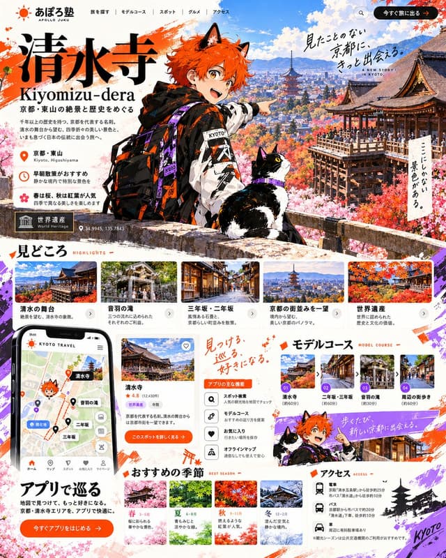
Infographic / Edu Visual - Kiyomizu-dera Travel LP with Anime Mascot

Infographic / Edu Visual - Kiyomizu-dera Travel LP with Anime Mascot

あぽろGPT Image 2
Goal: Create a comprehensive, high-density vertical travel landing page (LP) for Kiyomizu-dera in Kyoto.
Canvas: Vertical aspect ratio (approx. 4:5), featuring a vibrant mix of anime illustration and realistic photography with a clean white background accented by orange and purple brushstrokes.
Layout:
1. Header: Top navigation bar with logo 'あぽろ塾 APOLLO JUKU' on the left, menu items (Search, Model Course, Spot, Gourmet, Access) in center, and an orange CTA button '今すぐ旅に出る' on right.
2. Hero Section: Large title '清水寺 Kiyomizu-dera' in bold black serif font. Subtitle '京都・東山の絶景と歴史をめぐる'. A central anime character (orange hair, cat ears, streetwear jacket with 'KYOTO' text) pointing right, accompanied by a tuxedo cat. Background shows a panoramic view of Kyoto with autumn foliage and pagodas. Floating handwritten text: '見たことのない京都に、きっと出会える。' and 'ここにしかない景色がある。'. Location info block: '京都・東山', '早朝散策がおすすめ', '春は桜、秋は紅葉が人気'. World Heritage badge and coordinates '34.9945, 135.7843'.
3. Highlights Section ('見どころ'): Horizontal scrollable cards showing photos of '清水の舞台', '音羽の滝', '三年坂・二年坂', '京都の街並みを一望', '世界遺産'. Each card has a photo, title, and short description.
4. App & Features Section: Left side features a smartphone mockup displaying a map app interface with pins for Kiyomizu-dera, Otowa Waterfall, etc. Center column lists 'アプリの主な機能' (App Main Features) with icons: Spot Search, Model Course, Favorites, Offline Map. Right side is 'モデルコース' (Model Course) with numbered steps 01-04 showing route thumbnails.
5. Seasonal Recommendations ('おすすめの季節'): Four distinct seasonal blocks (Spring, Summer, Autumn, Winter) with corresponding landscape photos and brief text descriptions.
6. Access Section ('アクセス'): Bottom right area listing transport options (Train, Bus, Car) with specific station names and walking times. Includes a small silhouette of a pagoda and 'Kyoto' script.
Visual style: Modern Japanese web design aesthetic. High contrast between the colorful anime mascot and the serene real-world photography. Use of orange (#FF5722 approx) and purple accents. Clean sans-serif typography for body text, elegant serif for headings.
Text content: Preserve all Japanese text exactly as shown in the image, including section headers like '見どころ', 'モデルコース', 'アクセス', and the specific location names.
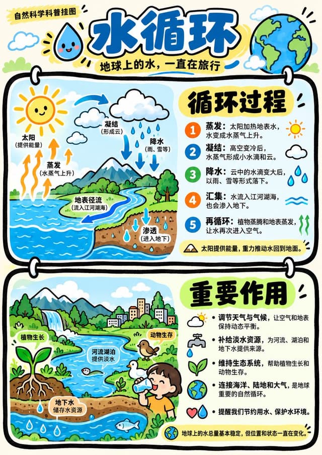
Infographic / Edu Visual - GPT Image 2 Hand-drawn Infographic Prompt

Infographic / Edu Visual - GPT Image 2 Hand-drawn Infographic Prompt

小小东GPT Image 2
Two vertically connected rounded rectangular panels are anchored by extremely thick, slightly undulating black hand-drawn outlines, with white buckles crossing the panel edges, forming striking paired modules and clear vertical rhythm. Content is organized using Gestalt proximity and layout zoning, with each panel internally divided into a stable left-image/right-text column, balancing left and right weights, titles and information read top-to-bottom in the right column; the overall visual center falls on the junction of the two panels and their respective prominent large titles, keeping the page header area independent with logos and main title. Images and text connect via juxtaposition and backing: the left side is reserved for character or theme illustrations, placed on irregular rounded clean light-colored bases; the right side uses prominent large characters to lead multiple lines of explanation, accompanied by small line-drawing symbols adjacent to text to indicate content. Text hierarchy is always distinct, large titles are thick and striking, explanatory text is thinner with generous line spacing, small text and symbols create rhythm points; glyph construction is upright and readable, with clear counters, crisp endings, and compact faces complementing handwritten images, maintaining this hierarchy regardless of text volume; when text is insufficient, secondary small text is supplemented based on the theme. Text edges are flat and clear, forming a clean typography layer outside the hand-drawn lines. Whitespace includes gaps between panels, backing whitespace around image bases, reading gaps between text lines, and pauses between header and body; each remains spacious, allowing thick frames, illustrations, and titles to stand out clearly. Illustration content is provided by the appended theme, adopting a complete, concentrated, slightly tilted hand-drawn composition within the left column, with simple main outlines, light dynamic details, and upright load-bearing parts; content density is about half-frame, mainly concentrated in the left column of each panel, the rest being white or light-colored rounded bases, flat panel color blocks, and bottom whitespace, generating no scenery. Uses a composite of techniques: outlining frames and characters with continuous, slightly shaky thick black lines; spreading large panel areas and local illustration colors with clean, smooth digital flat coloring; pressing information areas with crisp text typesetting; overall resembling an illustration arrangement synthesized from hand-drawn lines, computer flat coloring, and clear typesetting. Color scheme maintains a high-brightness keynote, colors vivid, saturated but not glaring, the most intense color surfaces fall within the paired panels echoed by character locals; pairing warm light backgrounds with varying brightness levels of light color surfaces, stabilizing layers with strong black-and-white line text contrast. Overall warm and cheerful, friendly and energetic, resembling matte digital color blocks combined with dense marker lines; hue follows the theme, but brightness/darkness, thickness/thinness, saturation/dilution, warm tendencies, and cheerful friendly psychological feelings maintain this personality regardless of theme. Overall temperament is light, friendly, and orderly. Appended theme, accurate text, usage, and aspect ratio take priority; grouping of upper/lower panels, left-image/right-text, thick black hand-drawn borders, image backing, clear text hierarchy, and high-brightness warm-thick color schemes remain unchanged.

------
Theme: Water Cycle Educational Poster
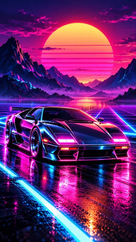
Social Media Post - Synthwave Sports Car at Sunset
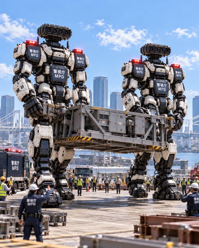
Social Media Post - Giant MPD Robots Carrying Heavy Load
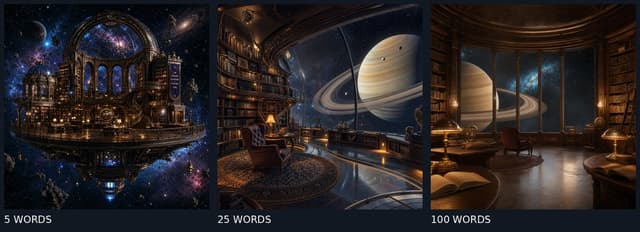
Social Media Post - GPT Image 2 Prompt Length Comparison

Find your next direction

ASTORIE CANVAS

Take the idea further.

Bring your prompts, references and results together in one creative space.

Open your canvas ↗