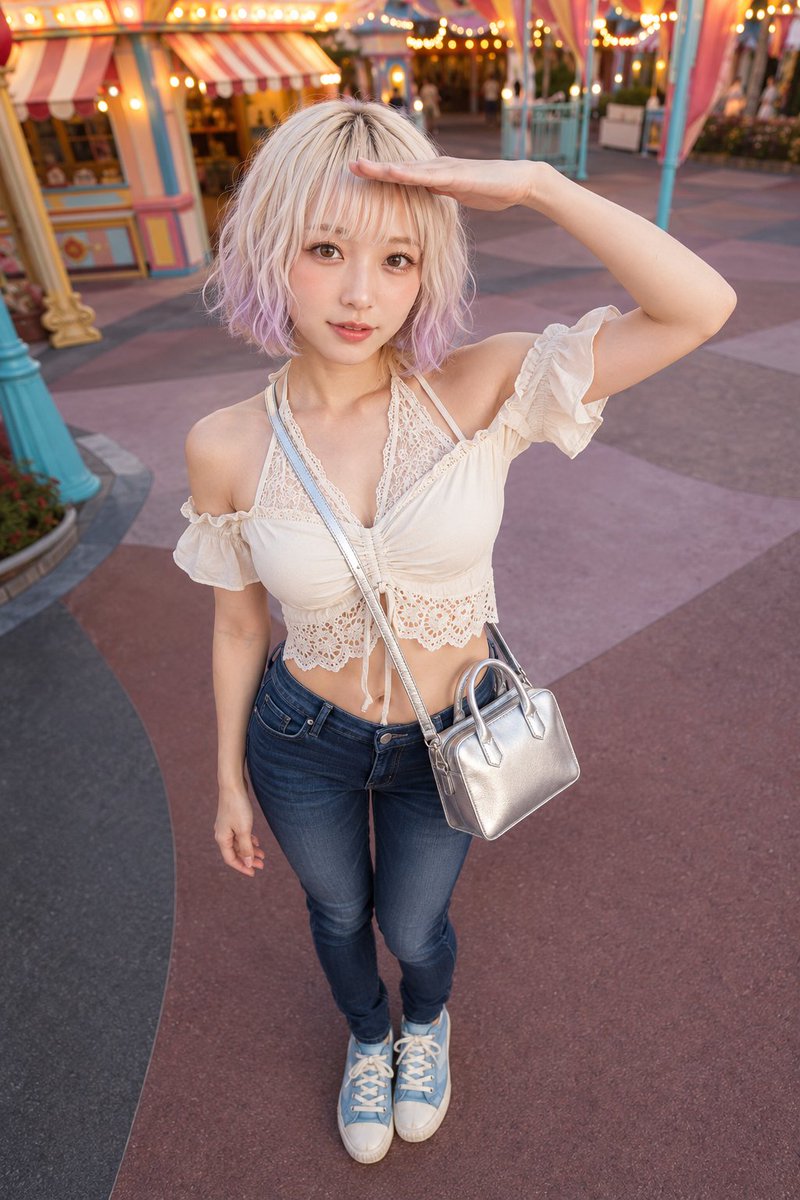
E-commerce Main Image - Advanced Wardrobe Consistency Rules

A complex instructional prompt for maintaining garment identity across AI generations, detailing specific tops, denim, and sneakers with high precision.

Prompt

2,838 charactersOpen Astorie studio ↗
保護されたワードローブのルール — 最優先事項:以下の各衣服の説明を、不変の最終製品アイデンティティとして扱ってください。構造、パーツ、金具、素材、パターン、および登録されたすべてのグラフィックやマーキング(その表面、側面、向き、スケール、色、内容、スペル、数)を保持してください。最終的な着用状態は、対象となるアイテムの使用、位置、側面、向き、留め具、レイヤリング、折り目、タック、結び目、ドレープのみを上書きします。「ソース衣服」ラベルはスタイリング前のアイテムを表し、完成したシルエットではありません。保護された詳細を再設計、追加、削除、反転、複製、再配置、または描き直さないでください。ワードローブ:トップス:軽量で柔らかくシワ加工されたアイボリーのコットン製のクロップドオフショルダーブラウス。体にフィットする胴体と、密にギャザーを寄せたバストパネルが特徴です。ギャザーの入ったネックラインの上に深いV字型のフローラルレースインセットがあり、2つのレースの頂点から伸びる細いアイボリーのホルターコードが調節可能なタイを形成しています。伸縮性のある短い袖は柔らかいフリルを作り、フロント中央のドローストリングチャネルがバストにギャザーを寄せ、2本の細長いタイが垂れ下がっています。下端は幅広のアイボリーのアイレット刺繍バンド、フローラルカットワーク、スカラップヘムで仕上げられています。背面は伸縮性のある上端とアイレットバンドが続き、完全に対称的なクロップドシルエットになっています。レースのインセット、袖、タイ、アイレットヘムを一着の衣服として統合し、別のアンダーレイヤー、ロゴ、ラベル、テキストは含めないでください。ボトムス:中濃色のインディゴストレッチデニムを使用した、ローライズでフィット感のある5ポケットジーンズ。ヒップと太ももはタイトで、そのままクリーンなスリムレッグに続きます。等間隔のベルトループ、中央のジッパーフライ、円形のシルバーブルーのフロントボタンを備えたシェイプされたウエストバンドを作成してください。カーブしたフロントポケット、小さなコインポケット、外側のポケット角に合わせたシルバーブルーのアクセントリベット、ダークメタルの補強リベット、リアヨーク、クリーンなパッチポケットを追加してください。同系色のインディゴのステッチ、フロントライズの微妙なヒゲ加工、脚上部のソフトな縦落ち、そして綺麗に仕上げられた裾を使用してください。ベルト、プリントグラフィック、ロゴ、読み取り可能なテキストは含めないでください。フットウェア:解剖学的にミラーリングされた一対の、ダスティスカイブルーのキャンバス製ローカットレースアップスニーカー。局所的なミントアクアのグラフィックとアイボリーのラバーが特徴です。各シューズはコンパクトなロープロファイル、幅広の丸みを帯びたクローズドトゥ、そしてわずかにかかとが上がった厚みのあるほぼ水平なプラットフォームを備えています。パッド入りの低い履き口が長いシュータンを囲んでいます。アッパーは、ブルーのキャンバスヴァンプ、対向するアイレットフェイシング、幅広のクオーターパネル、補強されたヒールパネルを組み合わせています。アイボリーのラバーシェルトゥキャップと深いアイボリーのフォキシングサイドウォールが下端を縁取っています。外側のクオーターには、ギザギザの葉、2本のカールした茎、細かい脈のハッチング、ドットのアクセントがある、密度の高いミントアクアのアネモネ3輪のスプレーが描かれています。「IVY ARC」という大文字の単語が、アイボリーのフォキシング全周に沿って、1単語3文字の等間隔の単一行ユニットとして広いトラッキングで連続して繰り返されています。銀色の小さなアイレットが偶数列に並び、平らなアイボリーの靴紐が通常の十字路を通っており、紐は中央でコンパクトなリボン結びになっています。内側のクオーターは無地のブルーキャンバスのままで、リアパネル、アイボリーの裏地、ダークなトレッドは、解剖学的な反転を除いて左右で一致しています。キャンバスはマットに、ラバーはソフトな質感に、植物のラインワークは鮮明に、そしてすべての浮き出し文字を明確に判読できるようにしてください。バッグ:滑らかな連続フォイル表面、しっかりとした形状保持、丸みを帯びたエッジパイピング、ポリッシュ仕上げのシルバー金具を備えた、高光沢メタリックコーティングのレザー風素材で作られたコンパクトなメタリックシルバーのミニトート。ボディは、上部の角がわずかに丸みを帯びた短いほぼ長方形の封筒型で、スリムなサイドガセットと平らな補強ベースがあります。ハンドル間に狭いトップアクセス開口部があります。フロント、リア、ガセット、ベースを、境界エッジの周りに連続したパイピングを持つ一つの構造化されたボディとして構築してください。2つの短いアーチ型ハンドルを、細いステッチタブでフロントとリアのアッパーフェイスに取り付けてください。アッパーサイドシームの小さなリングに固定されたクリップ末端を持つ、細長いお揃いのストラップを1本追加し、長方形の長さ調節スライダーをはっきりと見せてください。上部の開口部は、コンパクトなジッパーと目立たないポリッシュ仕上げのスライダーで閉じてください。フロント、リア、ガセット、ベースには追加のポケットやグラフィックを入れず、ストラップアンカー、ハンドルタブ、パイピング、ジッパー、ベース補強が同じボディに物理的に結合されているようにしてください。鮮明な構造、制御された継ぎ目の厚み、滑らかなメタリックのカバレッジ、そしてソフトな指向性反射を維持してください。最終着用状態:視点条件付きボディサイドマップ:正面図 — 着用者の左は画像の右、着用者の右は画像の左。背面図 — 着用者の左は画像の左、着用者の右は画像の右。側面図、交差した手足、または曖昧な場合は、対応する肩、腰、目、または耳の目印から名前の付いた解剖学的側面を連続的に追跡してください。この状態は指定された解剖学的側面にのみ適用し、反転、入れ替え、または複製は決してしないでください。- バッグの持ち方:最終状態:登録されたねじれのないストラップまたはチェーン1本が、元の両端で取り付けられ、着用者の右肩からすべての重量を支え、解剖学的なフロントセンターラインを一度横切り、着用者の左前の腰でバッグを平らに支えます。バッグの背面は体に向き、前面は外側を向きます。両手は離したままにします。登録されたサポートとコンポーネントを接続したままにし、選択したルートに沿ってのみ接触と重力による余裕を許容してください。この操作内での自然な取り扱い:選択したルートとすべての取り付けポイントを正確に保ちながら、素材に応じた適度な緩みと自然な体との接触を許容してください。
From sourceView source ↗

More to explore

Game Asset - Medieval MMORPG Inventory UI Screenshot

Game Asset - Medieval MMORPG Inventory UI Screenshot

Mormon NegroGPT Image 2
Goal: Create a realistic screenshot of a medieval MMORPG inventory and storage interface, specifically featuring a chest (Baúl) and character equipment panel.
Canvas: Landscape orientation, high resolution, mimicking a game client window.
Layout: Split composition. The left third shows the 3D game world with a cobblestone street, a wooden cart, an NPC, and a player character standing next to a large open treasure chest. The right two-thirds are occupied by two vertical UI panels overlaying the scene.
Sections:
1. Left Panel (Storage): Header reads "BAÚL" in gold serif font on a dark metal background. Contains a grid of empty dark slots. Top row has three items: a sword (+15), a purple robe (+15), and black boots (+15). Bottom section displays "ORO EN EL BAÚL" with value 0, and buttons labeled "Cantidad", "GUARDAR", and "SACAR".
2. Right Panel (Inventory): Header reads "INVENTARIO". Top section is an equipment paper-doll layout with slots labeled "CUELLO", "ARMADURA", "ESCUDO" containing a helmet, breastplate, and shield icons. Below is a mixed grid of inventory items including potions, keys, axes, and armor pieces. Bottom section displays total "ORO" as 34.181.599.
Visual style: Dark fantasy aesthetic. UI frames have ornate gold filigree corners and riveted metal textures. Fonts are classic serif (Times New Roman style) in white and gold. Lighting is ambient daylight.
Text content: Preserve Spanish labels exactly as seen: "BAÚL", "INVENTARIO", "ORO EN EL BAÚL", "GUARDAR", "SACAR", "CANTIDAD", "CUELLO", "ARMADURA", "ESCUDO", "ORO".
Infographic / Edu Visual - Kiyomizu-dera Travel LP with Anime Mascot

Infographic / Edu Visual - Kiyomizu-dera Travel LP with Anime Mascot

あぽろGPT Image 2
Goal: Create a comprehensive, high-density vertical travel landing page (LP) for Kiyomizu-dera in Kyoto.
Canvas: Vertical aspect ratio (approx. 4:5), featuring a vibrant mix of anime illustration and realistic photography with a clean white background accented by orange and purple brushstrokes.
Layout:
1. Header: Top navigation bar with logo 'あぽろ塾 APOLLO JUKU' on the left, menu items (Search, Model Course, Spot, Gourmet, Access) in center, and an orange CTA button '今すぐ旅に出る' on right.
2. Hero Section: Large title '清水寺 Kiyomizu-dera' in bold black serif font. Subtitle '京都・東山の絶景と歴史をめぐる'. A central anime character (orange hair, cat ears, streetwear jacket with 'KYOTO' text) pointing right, accompanied by a tuxedo cat. Background shows a panoramic view of Kyoto with autumn foliage and pagodas. Floating handwritten text: '見たことのない京都に、きっと出会える。' and 'ここにしかない景色がある。'. Location info block: '京都・東山', '早朝散策がおすすめ', '春は桜、秋は紅葉が人気'. World Heritage badge and coordinates '34.9945, 135.7843'.
3. Highlights Section ('見どころ'): Horizontal scrollable cards showing photos of '清水の舞台', '音羽の滝', '三年坂・二年坂', '京都の街並みを一望', '世界遺産'. Each card has a photo, title, and short description.
4. App & Features Section: Left side features a smartphone mockup displaying a map app interface with pins for Kiyomizu-dera, Otowa Waterfall, etc. Center column lists 'アプリの主な機能' (App Main Features) with icons: Spot Search, Model Course, Favorites, Offline Map. Right side is 'モデルコース' (Model Course) with numbered steps 01-04 showing route thumbnails.
5. Seasonal Recommendations ('おすすめの季節'): Four distinct seasonal blocks (Spring, Summer, Autumn, Winter) with corresponding landscape photos and brief text descriptions.
6. Access Section ('アクセス'): Bottom right area listing transport options (Train, Bus, Car) with specific station names and walking times. Includes a small silhouette of a pagoda and 'Kyoto' script.
Visual style: Modern Japanese web design aesthetic. High contrast between the colorful anime mascot and the serene real-world photography. Use of orange (#FF5722 approx) and purple accents. Clean sans-serif typography for body text, elegant serif for headings.
Text content: Preserve all Japanese text exactly as shown in the image, including section headers like '見どころ', 'モデルコース', 'アクセス', and the specific location names.
Infographic / Edu Visual - GPT Image 2 Hand-drawn Infographic Prompt

Infographic / Edu Visual - GPT Image 2 Hand-drawn Infographic Prompt

小小东GPT Image 2
Two vertically connected rounded rectangular panels are anchored by extremely thick, slightly undulating black hand-drawn outlines, with white buckles crossing the panel edges, forming striking paired modules and clear vertical rhythm. Content is organized using Gestalt proximity and layout zoning, with each panel internally divided into a stable left-image/right-text column, balancing left and right weights, titles and information read top-to-bottom in the right column; the overall visual center falls on the junction of the two panels and their respective prominent large titles, keeping the page header area independent with logos and main title. Images and text connect via juxtaposition and backing: the left side is reserved for character or theme illustrations, placed on irregular rounded clean light-colored bases; the right side uses prominent large characters to lead multiple lines of explanation, accompanied by small line-drawing symbols adjacent to text to indicate content. Text hierarchy is always distinct, large titles are thick and striking, explanatory text is thinner with generous line spacing, small text and symbols create rhythm points; glyph construction is upright and readable, with clear counters, crisp endings, and compact faces complementing handwritten images, maintaining this hierarchy regardless of text volume; when text is insufficient, secondary small text is supplemented based on the theme. Text edges are flat and clear, forming a clean typography layer outside the hand-drawn lines. Whitespace includes gaps between panels, backing whitespace around image bases, reading gaps between text lines, and pauses between header and body; each remains spacious, allowing thick frames, illustrations, and titles to stand out clearly. Illustration content is provided by the appended theme, adopting a complete, concentrated, slightly tilted hand-drawn composition within the left column, with simple main outlines, light dynamic details, and upright load-bearing parts; content density is about half-frame, mainly concentrated in the left column of each panel, the rest being white or light-colored rounded bases, flat panel color blocks, and bottom whitespace, generating no scenery. Uses a composite of techniques: outlining frames and characters with continuous, slightly shaky thick black lines; spreading large panel areas and local illustration colors with clean, smooth digital flat coloring; pressing information areas with crisp text typesetting; overall resembling an illustration arrangement synthesized from hand-drawn lines, computer flat coloring, and clear typesetting. Color scheme maintains a high-brightness keynote, colors vivid, saturated but not glaring, the most intense color surfaces fall within the paired panels echoed by character locals; pairing warm light backgrounds with varying brightness levels of light color surfaces, stabilizing layers with strong black-and-white line text contrast. Overall warm and cheerful, friendly and energetic, resembling matte digital color blocks combined with dense marker lines; hue follows the theme, but brightness/darkness, thickness/thinness, saturation/dilution, warm tendencies, and cheerful friendly psychological feelings maintain this personality regardless of theme. Overall temperament is light, friendly, and orderly. Appended theme, accurate text, usage, and aspect ratio take priority; grouping of upper/lower panels, left-image/right-text, thick black hand-drawn borders, image backing, clear text hierarchy, and high-brightness warm-thick color schemes remain unchanged.

------
Theme: Water Cycle Educational Poster

Social Media Post - Synthwave Sports Car at Sunset
Social Media Post - Giant MPD Robots Carrying Heavy Load
Social Media Post - GPT Image 2 Prompt Length Comparison

Find your next direction

ASTORIE CANVAS

Take the idea further.

Bring your prompts, references and results together in one creative space.

Open your canvas ↗