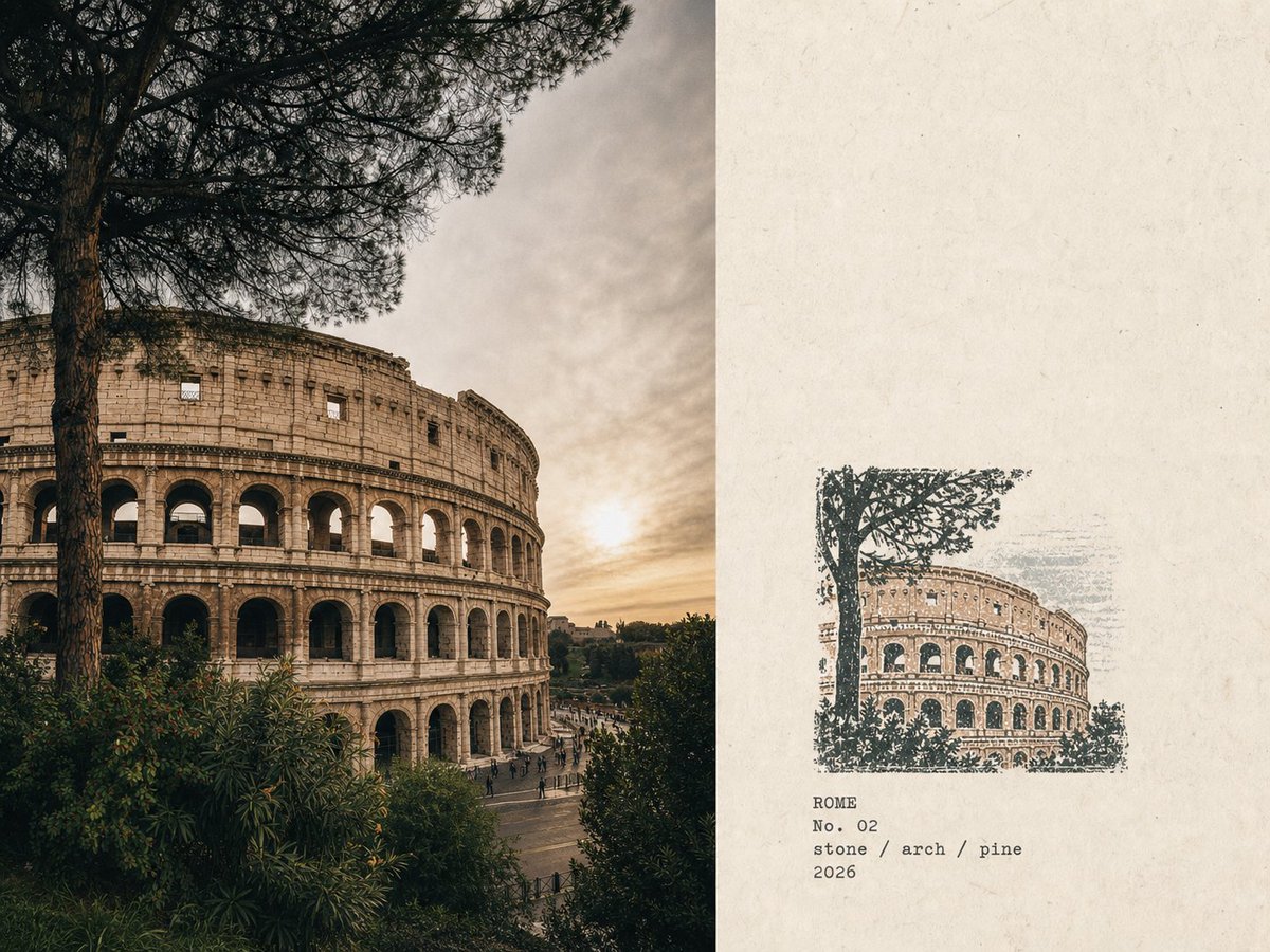
This prompt transforms travel photographs into a field notes style poster, featuring a clean layout with original photos on one side and a minimalist rubber stamp illustration on the other.
Please turn each photo I upload into an independent "Rubber Stamp Travel Field Notes Poster," outputting each photo separately without multi-image collage. The overall layout uses a 4:3 horizontal composition, dividing the screen into left and right areas, but without drawing obvious dividing lines. The left side occupies about 58% of the frame, faithfully preserving the original photo. Accurately maintain the identity of the subject, terrain, buildings, plants, people, spatial relationships, natural lighting, real textures, and original color atmosphere, applying only restrained art-publication-level photographic color grading and adding extremely slight fine film grain. Natural cropping is allowed to fit the layout, but do not stretch, distort, move, replace, or redraw the subject. The right side occupies about 42%, using warm off-white old paper as a background. The paper has subtle fibers, natural grains, slight signs of use, and a matte feel, while retaining large areas of unprinted paper white space, making the void an important part of the layout. Analyze the original photo to extract the most recognizable subject outlines, architectural structures, terrain trends, plant postures, roads, shorelines, or other key visual relationships, compressing them into a small multi-color rubber stamp image. Do not copy everything from the photo item by item. Retain only the minimum information necessary for someone to recognize the original location, subject, and scene relationships at a glance. Delete crowds, vehicles, dense windows, repetitive buildings, fine vegetation, decorative components, and irrelevant backgrounds. The stamp is located in the lower-middle part of the right paper area, occupying only about 30%-38% of the height of the right area, with sufficient white space reserved around it. The stamp cannot be enlarged into a common illustration, full landscape painting, or brand logo. Decide the organization of the stamp based on the original image's composition: - Iconic buildings: Keep the most recognizable outer outlines, roofs, domes, arches, towers, or main structures. - Mountain settlements: Compress buildings into a few stepped color blocks arranged along the terrain. - Coastal scenery: Keep the mountain trends, settlement levels, shorelines, and a few intermittent water ripples. - Urban vistas: Keep the main skyline, one landmark building, and one or two layers of distant mountains. - Natural landscapes: Keep the main mountain bodies, trees, shores, or road directional relationships. - Foreground obstructions: If important to the original narrative, keep them as foreground stamp outlines. Extract 2-4 spot ink colors from the original photo. Prioritize desaturated colors like carbon black, dark green, brick red, ochre yellow, grey-blue, and grey-brown, but do not force a fixed palette. Retain the most recognizable color character of the original photo, allowing only a small area of color for visual emphasis. Each color should appear as if individually hand-stamped: authentic rubber stamp carving textures, hand-cut marks, uneven hatching, outline gaps, broken edges, dry ink shortage, paper transparency, grainy ink, uneven pressure, partial ghosting, and a slight color registration offset of about 1-2 mm. Natural misalignment between different color layers is allowed; edges should not be digitally smooth. The imprint should look like a rubber stamp truly carved and pressed onto old paper, not a filtered photo, smooth vector illustration, or line-art logo. Generate text based on the location, theme, and visual imagery in the photo: Location name in English, No. serial number, three short English keywords, AD year. Place the text below the stamp or in the adjacent white space, using small, restrained, slightly...